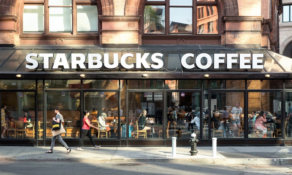
Wherever you are in the world, you can usually find a Starbucks somewhere nearby.
For some, this represents the great convenience of being able to find the comforts of home wherever you travel.
for others, this is just another case of a corporate monster killing off small local businesses.
Whatever your take on this debate, you are more than likely to have frequented a Starbucks coffee shop at least once in your life, but have you ever wondered about that ubiquitous green and white emblem?
Here, we answer the question: what is the meaning of the Starbucks logo?
Table of Contents
Who is the Starbucks lady
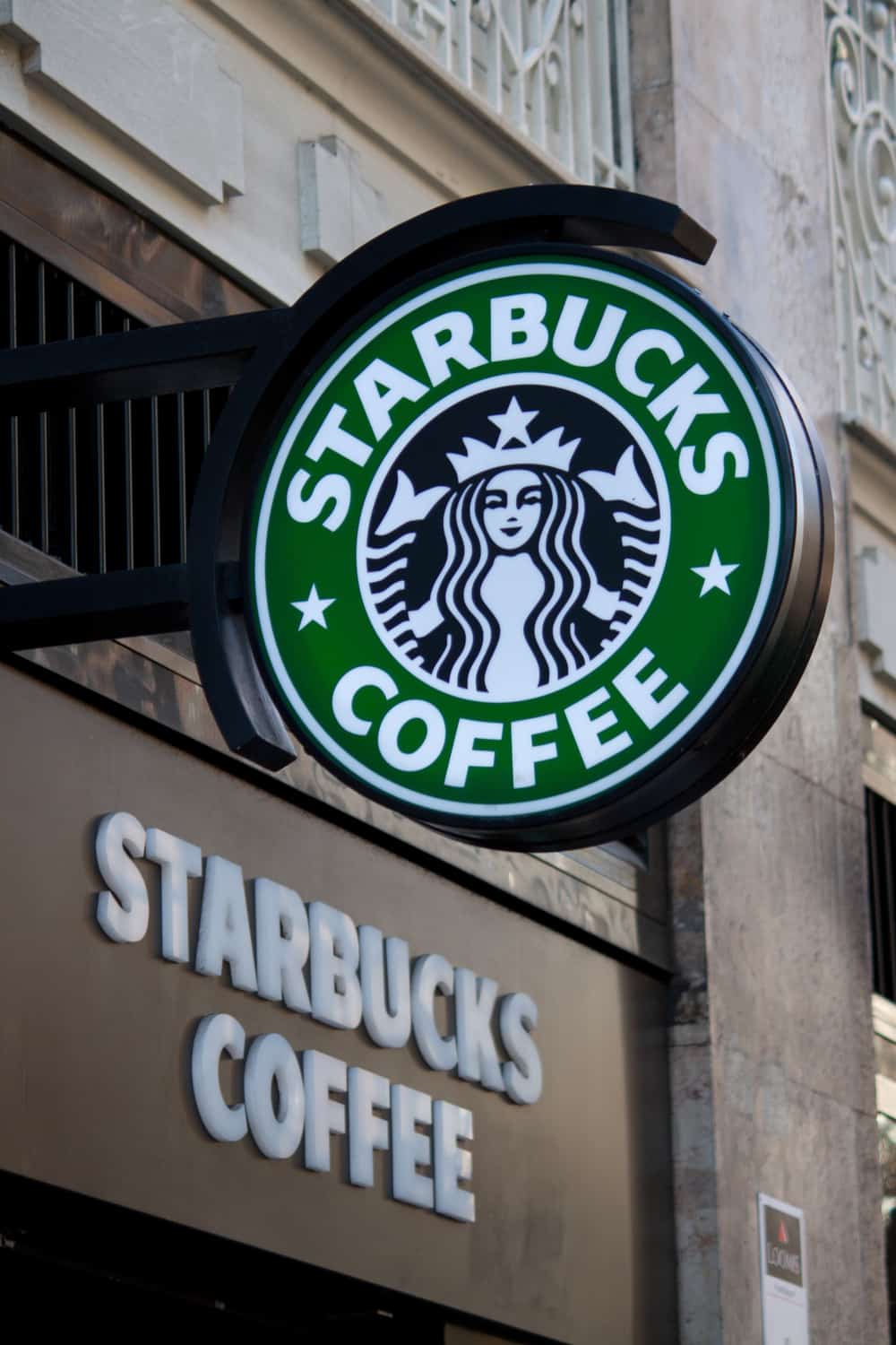
There can be few people who are unfamiliar with Starbucks’ iconic logo, but have you ever really looked at it?
It seems to depict a crowned lady who appears to be holding something, perhaps a fish, in each hand. Without prior knowledge, the first time you really look at the most recent version, it’s not entirely obvious what the image is supposed to represent.
Of course, most people will know that the figure we see emblazoned upon coffee shops the world over is usually claimed to depict a siren, a figure from Greek mythology. Sirens were thought to lure traveling seamen using their beautiful singing voices, causing their ships to flounder on the rocks.
In fact, she isn’t holding anything in her hands. What we can see are supposed to be her twin tails. The only problem here is that sirens didn’t have tails. In Greek mythology, sirens were usually supposed to be a cross between women and birds (1).
So perhaps we are confusing sirens and something else: maybe the lady is supposed to be another well-known mythical creature. It could be that she is actually a mermaid.
Why is the Starbucks logo a Mermaid? No, She Isn’t!
However, the mermaid theory doesn’t quite fit either. We all know mermaids are supposed to be half woman, half fish, right? But aren’t they only supposed to have one tail? So why does the lady in the Starbucks logo have two? We can suggest an answer.
If you search through your books on ancient mythology, there is another possibility. Medieval European mythology knew of another creature: the Melusine.
Melusines were similar to mermaids in that they were half woman, half fish, but they were often depicted with two tails. This is the creature that most closely resembles Starbucks’ familiar “siren”.
It is unknown how deeply the founders of Starbucks researched their ancient mythology when they chose the symbol. The simple fact is, two tails offer the possibility of asymmetrical design more suitable for use in a logo – and this is probably what guided their decision.
Mythological confusion aside, a siren is a particularly apt emblem for a coffee shop. In the same way, the fabled sirens of old enticed unwary sailors onto the rocks, Starbucks’ modern-day siren also does an admirable job of tempting high street passers-by in for a brew.
But how and why did they choose this sea-lady in the first place? We’ll come to that next!
So why a siren?
All discussion of exactly which mythical creature she represents aside, why did they choose her in the first place?
The answer to this question goes back to the very founding of the company in 1971. Back then, the original founders wanted to start a company that sold ground coffee and coffee beans, as well as tea and spices, that were imported from around the world.
Furthermore, the company was based at the Pike Place Market in Seattle, traditionally a port city where coffee and other products arrived on ships (2).
For these reasons, the founders wanted a name that reflected the high adventure and romance of travel on the open seas. For a name for their enterprise, they turned to Herman Melville’s Moby Dick for inspiration.
Initially, they wanted to name their business Pequod after Captain Ahab’s vessel. However, after some discussion, they settled upon Starbucks, after Starbuck, the Chief Mate on the Pequod.
Having settled on a seafaring name for their incipient company, they required a suitably maritime-themed logo and consequently began searching through old books on mythology for ideas.
As the Starbucks official website claims, the siren was “originally derived from a twin-tailed siren in an old sixteenth-century Norse woodcut” that they discovered in an old book – they had found the image they were looking for.
Or so they claim. There are now those who doubt the veracity of this story of the “Norse” origins of the image. In any case, this is the emblem Starbucks chose, and she is the icon we still associate with the world’s most famous coffee chain half a century later.
The Starbucks logo history
She was originally bare-breasted
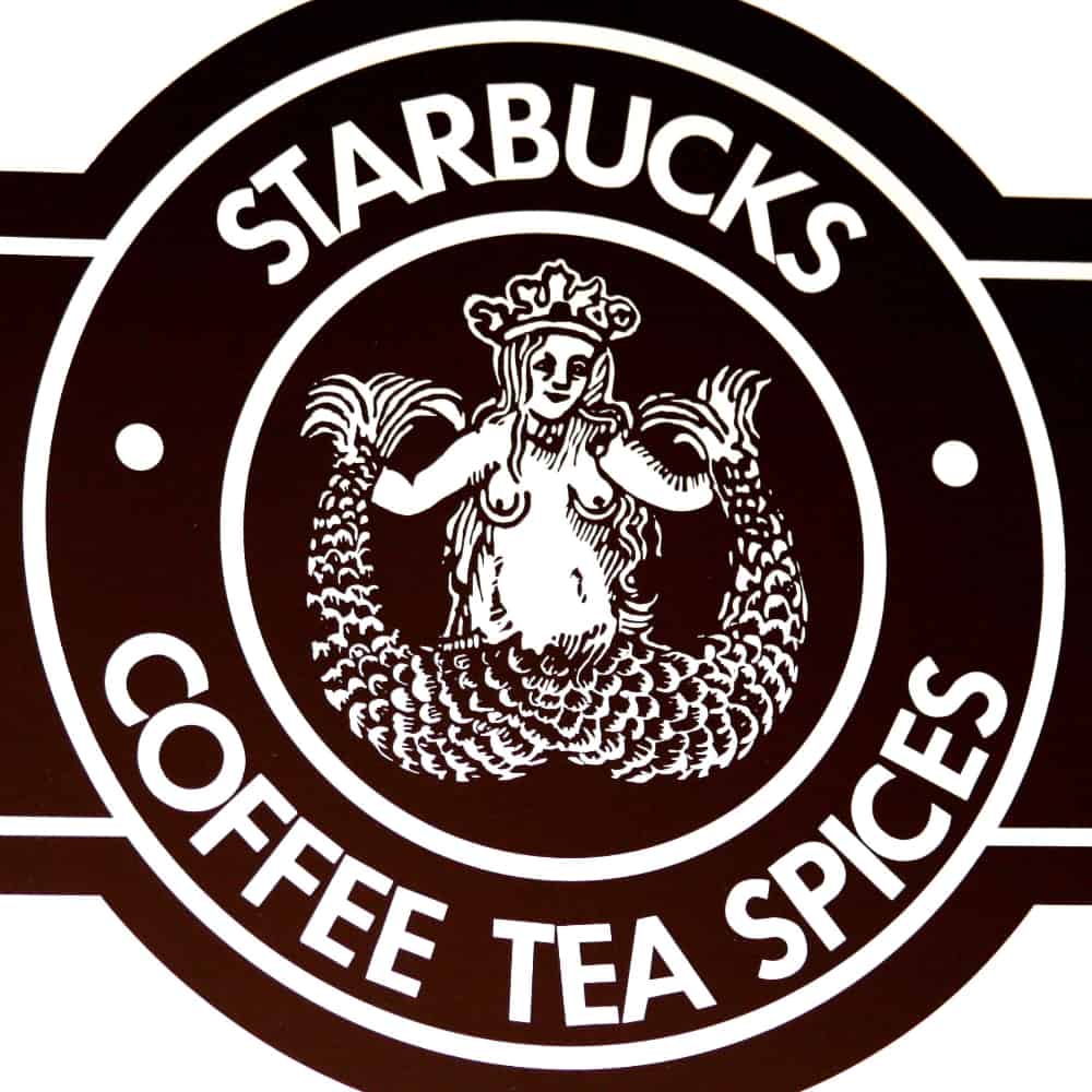
The original woodcut was some way from what we would consider the ideal corporate logo nowadays.
Starbucks took the lady from the woodcut and placed her within a circle, surrounded by the words “Starbucks – Coffee – Tea – Spices”. The background was brown, while the lettering and the lady were white.
The actual fish-lady herself was presented in quite intricate detail, staying faithful to the original woodcut. She was depicted with a crown upon her head, a tail curling up on either side of her…and the human part of her body quite naked with her breasts in full view.
The second version Starbucks Logo appeared in 1987
![]()
As Starbucks changed, so did their logo. In the first half of the 1980s, the company was acquired by Howard Schultz, a former director of retail operations and marketing at the company. They started to move away from the idea of a coffee, tea and spice store towards the coffee shop concept.
It was at about this time that they decided the original logo was no longer suitable for what the company wanted to represent.
The second version of the logo was unveiled in 1987, by which time the chain had already opened 17 stores, including branches in Chicago and Vancouver in Canada.
The 1987 logo was still recognizably based on the original 1971 version but had already become much more stylized. The two-tailed siren was now white on black. Her breasts were covered by her wavy hair but with her navel still visible, making her more appropriate for a wider audience.
Around the black and white central section, the words “Starbucks Coffee” were written in white capital letters against a green background, the first time this color was used. The decision to drop the words “tea” and “spices” demonstrated the company’s decision to move in a new direction.
The new logo now also included one star on either side of the siren.
A third Starbucks logo was unveiled in 1992
![]()
By 1992, Starbucks was already a significant company with 165 branches – although as yet, with none outside North America. It was time for another redesign of the logo.
The third iteration “zoomed in” more on the head and upper body of the siren so that the lower part of her body was no longer in view. In this new version, her navel was also not visible anymore. The color scheme remained the same as in the second version.
In this third incarnation, the words “Starbucks Coffee” were retained, as were the stars on either side of the siren. This third version of the famous logo was a much simpler, more uncluttered design.
The present-day Starbucks logo was created in 2011
![]()
The fourth version of the logo, and the emblem still used by the company to this day, was revealed in 2011 to coincide with the 40th anniversary of the founding of Starbucks.
With the fourth version, there are some striking differences in design – as well as one other very subtle change which we’ll be talking about in just a moment (3).
The logo is now entirely green and white, with no black anywhere to be found. This version also no longer includes any words. All that is left is the siren in the center, with only her head and upper-body depicted along with her twin tails on either side.
The removal of the writing is probably the most obvious change, and it was done for a couple of reasons. First, the writing tended to dominate the old logo, taking attention away from the siren herself and concentrating your gaze on the text.
Interestingly, a second reason for the removal of the words was that it is now a lot harder for other companies to imitate the design.
Before, by using similar font but with different text and image, it was quite easy to open imitation Starbucks-style coffee shops that looked very similar. Now it is much more difficult to fool people.
It is a simple and unmistakable emblem and is now one of the most easily-recognizable logos in the world.
She is not perfect
So what is the one subtle design feature we just alluded to? You may never have examined the Starbucks siren closely, but even if you’re a big Starbucks fan and you have spent time contemplating the logo, you may still never have noticed. This may come as a bit of a shock to you…
She’s not perfect.
When in-house designers from Starbucks and designers from Lippincott were working on the redesign, they originally produced a perfectly symmetrical siren that they thought represented flawless beauty. Except their perfect new Starbucks siren somehow left them all feeling cold.
After much debate and experimentation, the design team finally realized that the perfect “mask” they had created for the siren’s face seemed hollow and even a little creepy.
While we might imagine that perfect symmetry represents the pinnacle of human beauty, it turns out that we expect to find some imperfections in what we see. If the face is too perfect, we reject it as somehow seeming wrong.
Once they realized this, the designers went back to drawing board and made the tiniest adjustment. If you look very carefully, you can see that the shadowing on her right eye is slightly longer than that on the left.
It is this tiny difference that gives her depths of character and personality, even a touch of mystery and allure, just the way a siren should be.
And we’re willing to bet you probably never even saw it before!
The logo has been the subject of several conspiracy theories
As with many famous corporate logos, a couple of interesting conspiracy theories have been presented about sinister meanings hidden within the Starbucks badge (4).
One theory posits that the beatific siren familiar from coffee shops around the world is actually supposed to be the biblical Queen Esther and that Starbucks somehow represents a Zionist Jewish conspiracy.
Others have detected masonic imagery in the logo or attribute the design as being a medium for passing subliminal messages to the masses by the Illuminati. Apparently, some people believe they are trying to brainwash us by use of an insidious image on the side of our cup of coffee.
Finally, some extremely imaginative minds have even suggested the idea that the Starbucks siren logo bears more than a passing resemblance to certain imagery used by some satanic cults and that Starbucks is somehow linked to the occult.
All we’ll say on the matter is that we’ll leave judgment to you on this one!
Much more to a logo than meets the eye
For most people, it’s just the familiar green and white emblem of one of the most successful coffee shops in the world and, for anyone living in a reasonably big city, something you probably see somewhere at least once every day of your life.
However, as is often the case, there is so much more to the Starbucks logo than meets the eye. If you’ve ever asked yourself that question – what is the meaning of the Starbucks logo? – then we hope you are now more…illuminated.
Do you know any other interesting facts about the Starbucks logo? And what about Starbucks itself? Do you love it or loathe it? Please let us know your thoughts, we always love to hear from you – and if you enjoyed this article, please don’t forget to share!
I really got more information in this website and more influences
Liliana&katie